
Airport Delays + Cluster Analysis
Project Summary
In this project I examined three datasets related to 74 airports operations metrics over a 10 year period. The datasets consist of duration information for arrivals and departures on times to gate, time to taxi and total time to take off. This dataset in particular is a good candidate for a PCA analysis given that many of the features are subsets or derivatives of eachother. Upon final conclusion, you’re able to see that in using PCA, I was able to significantly reduce the dimensionality of the dataset while maintaining much of the explained variance. In doing so I was able to get look closer at specific airport characteristics that lead to airport delays.
Preparing the Datasets
The airport datasets were in three separate csv files. The cancellations csv detailed the number of cancellations and diversions for an aiport in a year. The operations csv detailed arrival and departure delays/diversions by airport and the airports csv detailed names and characteristics for each airport code.
df_raw = pd.read_csv('../assets/airport_cancellations.csv')
cancellations_df = pd.read_csv('../assets/Airport_operations.csv')
airports_df = pd.read_csv('../assets/airports.csv')
def columns_to_lower(df):
    """lowercase all column names in a dataframe"""
    df.columns = [i.lower() for i in df.columns]

columns_to_lower(df)
columns_to_lower(airports_df)
combined_df = pd.merge(cancellations_df, airports_df,
                       left_on='airport', right_on='locid')
all_data = pd.merge(combined_df, df, left_on=[
                    'airport', 'year'], right_on=['airport', 'year'])
Exploratory Data Analysis
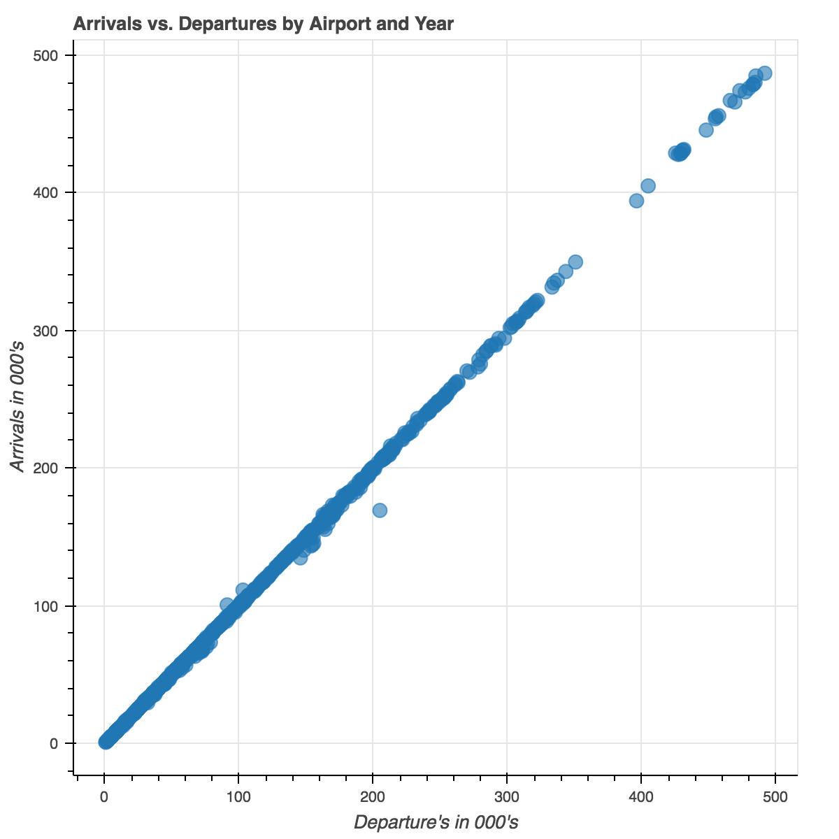
As you can see above, there’s almost a perfect correlation between arrivals and departures. This should come to no surprise as you should expect that the number planes arriving to an airport should equal the number of planes that are leaving. However, this is a perfect example of where PCA is at it’s most useful. These two columns, arrivals and departures, are currently two features in our dataset, but they explain the same variances in the data. Using PCA within this context will reduce the dimensionality and will allow for data compression while maintaining most of the relevant information.
The image below shows gate departure delays within the context of a US map. The size of the bubbles correspond to the total number of departures from a given airport. The color map corresponds to the average gate departure delay where red circles have average gate departure delays in excess of the median, blue is less than the median and white is the median value at 12.54 minutes.
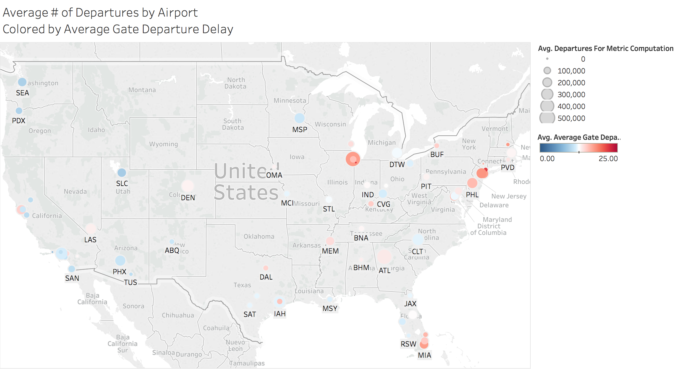
One interesting thing to note is that the size of the airport does not necessarily indicate the airport will have issues with departure delays. Some of the smallest airports have some of the worst wait times and some large airports are below the median value e.g. Phoenix, Salt Lake City and Seattle.
Heatmap Analysis
In looking at the correlations prior to performing PCA you can get an idea for which variables are highly correlated with eachother. In this regard you can get a sense for the features that are likely to be diminished with the PCA analysis as they explain the same variances.
corrmat = airport_pca_data.corr()
sns.heatmap(corrmat)
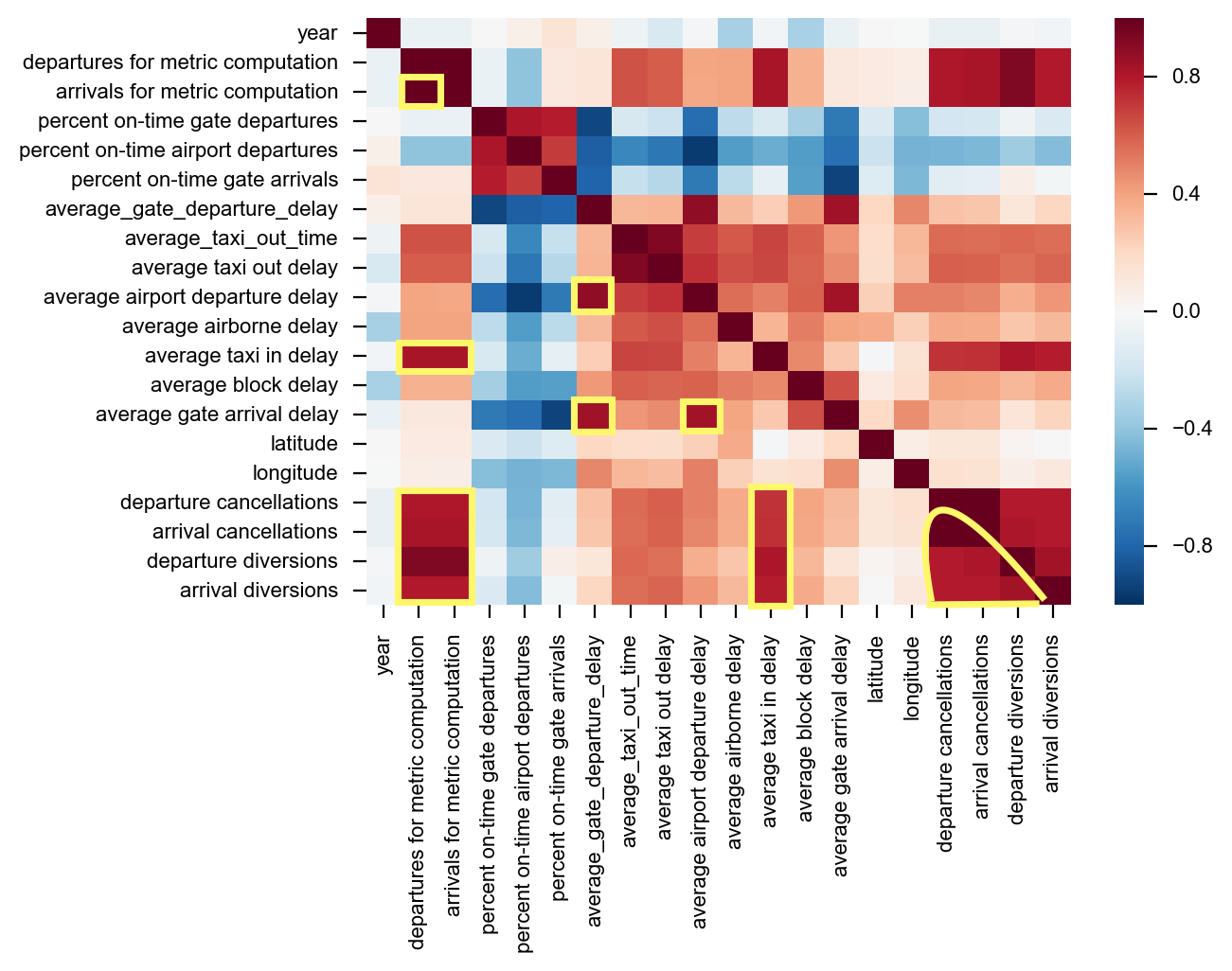
Strong Correlations:
- Total Departures & Arrivals
- Total Departures/Arrivals & Departure/Arrival Cancellations and Diversions
- Average Gate Departure Delay & Average Gate Arrival Delay
- All Cancellations/Diversions & Average Taxi in Delay
- Departures/Cancellations & themselves
Prepare the Data for PCA
Given that I was performing a PCA analysis I wanted to make sure I standardized the features beforehand. This is extremely important with PCA given that PCA is all about determining which principal components have the largest possible variance. So you want to make sure you measure the features on the same scale and assign equal importance to each.
# split the dataframe into X and y values
X = airport_pca_data.iloc[:, 1:].values
y = airport_pca_data.iloc[:, 0].values

ss = StandardScaler()
X_std = ss.fit_transform(X)
Calculate the Eigenvalues and Eigenvectors from the Covariance Matrix
I was able to use numpy.cov function to compute the covariance matrix of the standardized dataset.
cov_mat = np.cov(X_std.T)
eigen_vals, eigen_vecs = np.linalg.eig(cov_mat)
The eigen_vecs variable I’ve defined here represent the principal componants, or direction of maximum variance, whereas the eigen_vals is simply a scalar that defines their magnitude.
tot = sum(eigen_vals)
# var_exp ratio is fraction of eigen_val to total sum
var_exp = [(i / tot) for i in sorted(eigen_vals, reverse=True)]
# calculate the cumulative sum of explained variances
cum_var_exp = np.cumsum(var_exp)
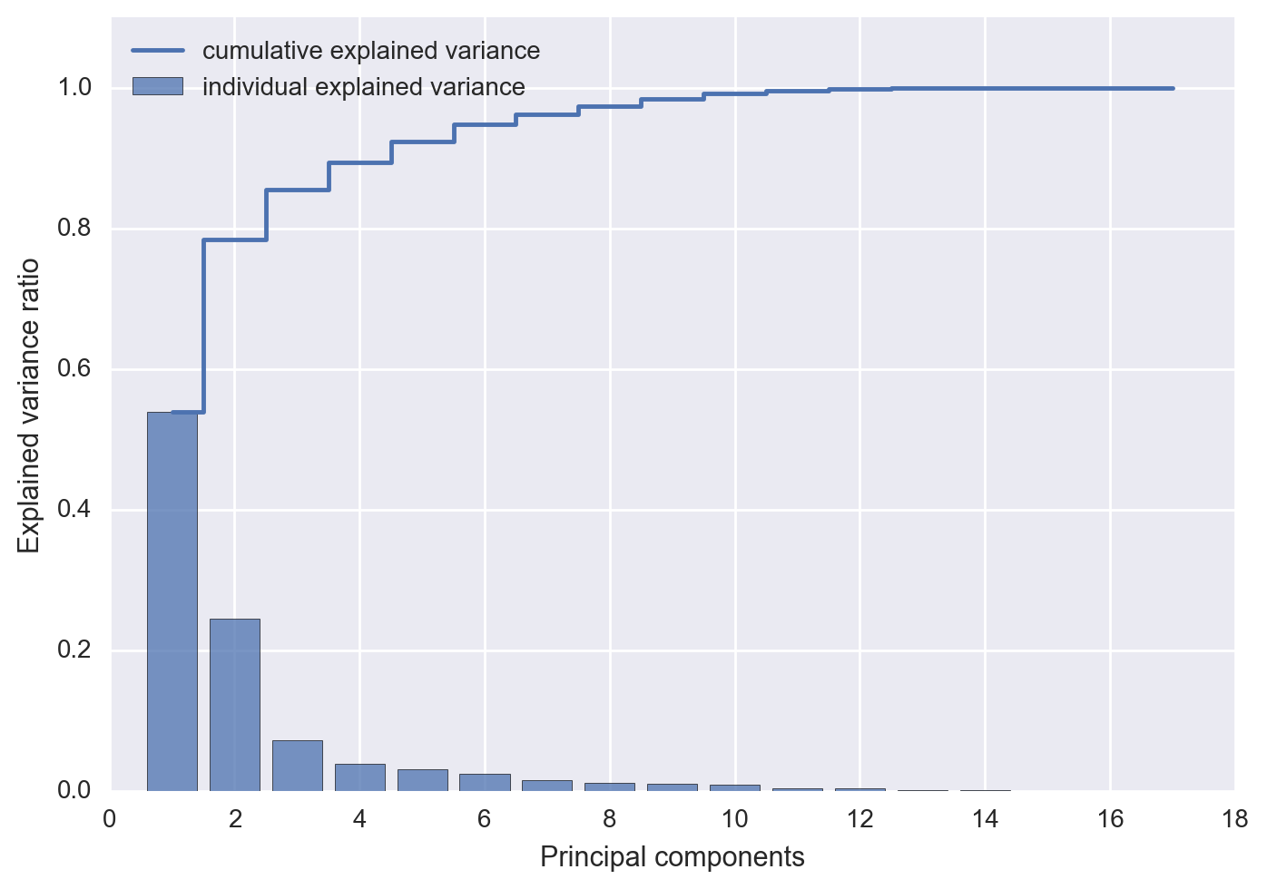
The cum_var_exp variable is just the cumulative sum of the explained variance and the var_exp is the ratio of the eigenvalue to the total sum of eigenvalues. I plotted both of these values below in order to see what percentage of the total variance is explained by each principal component. Since the eigenvalues are sorted by decreasing order we can see the impact of of adding an additional principal component.
import matplotlib.pyplot as plt

plt.bar(range(1, 18), var_exp, alpha=0.75, align='center',
        label='individual explained variance')
plt.step(range(1, 18), cum_var_exp, where='mid',
         label='cumulative explained variance')
plt.ylim(0, 1.1)
plt.xlabel('Principal components')
plt.ylabel('Explained variance ratio')
plt.legend(loc='best')
plt.show()
What Does this Indicate?
The first two principal components combined explain almost 80% of the variance in the data. The first three components explain 85% of all the variance in the data, after which you start to really see diminishing returns for retaining additional eigenvalues. After about 10 principal components almost 100% of all variance is accounted for. For a dataset with low dimensionality, we can use the heuristic of taking the first k eigenvalues that capture 85% of the total sum of eigenvalues. In the case of the airport dataset first three principal components will clear this hurdle.
Fit and Transform both Models
from sklearn.linear_model import LogisticRegression
from sklearn.decomposition import PCA

pca = PCA(n_components=2) # PCA with 2 primary components
pca_3 = PCA(n_components=3) #PCA with 3 primary components

# fit and transform both PCA models
X_pca = pca.fit_transform(X_std)
X_pca_3 = pca_3.fit_transform(X_std)
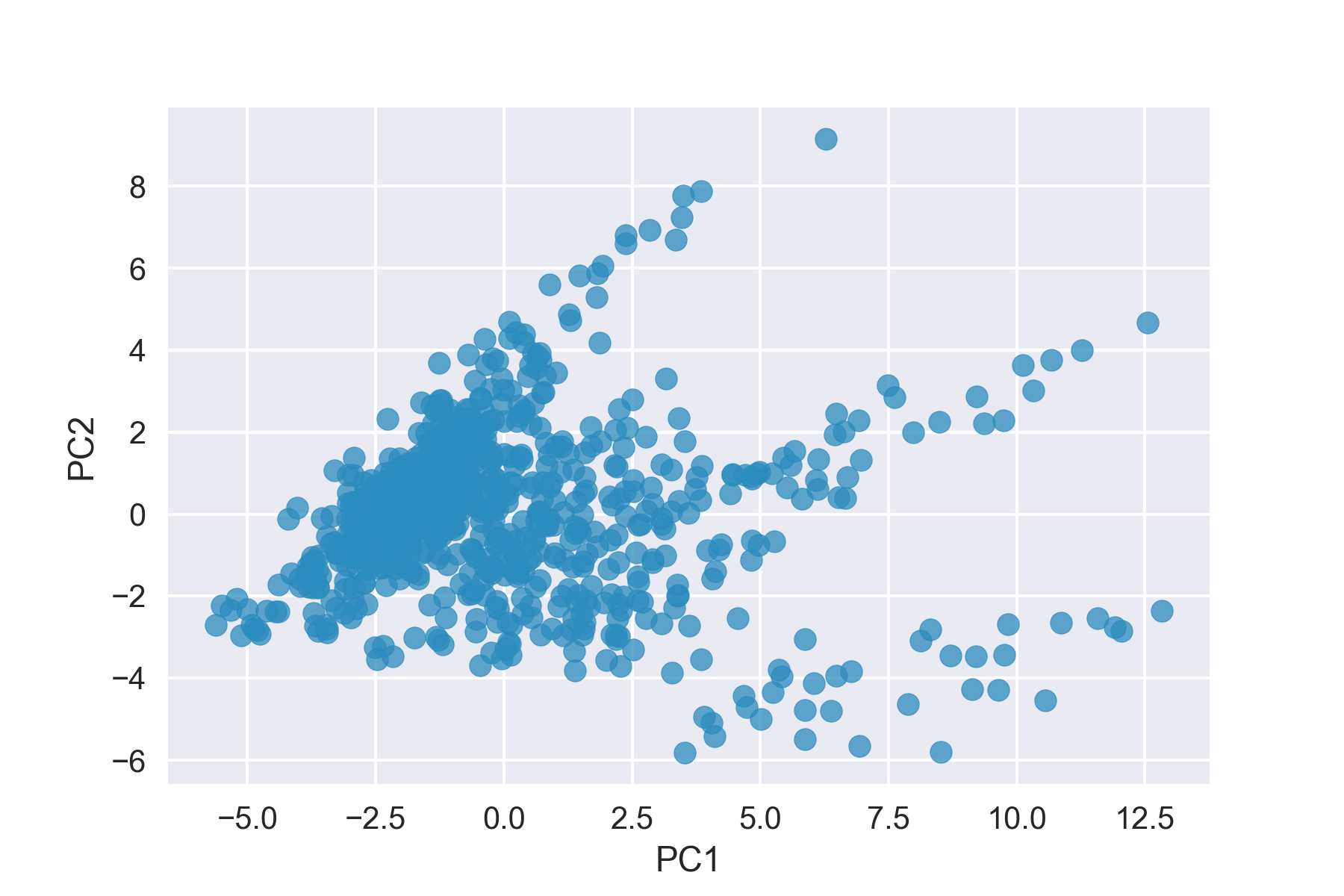
Here you’re able to see our airport data in it’s 2-d feature subspace. There’s still quite a bit of noise and not a clear delineation in the 2-d feature subspace.
plt.scatter(X_pca.T[0], X_pca.T[1], alpha=0.75, c='blue')
plt.xlabel('PC1')
plt.ylabel('PC2')
plt.show()
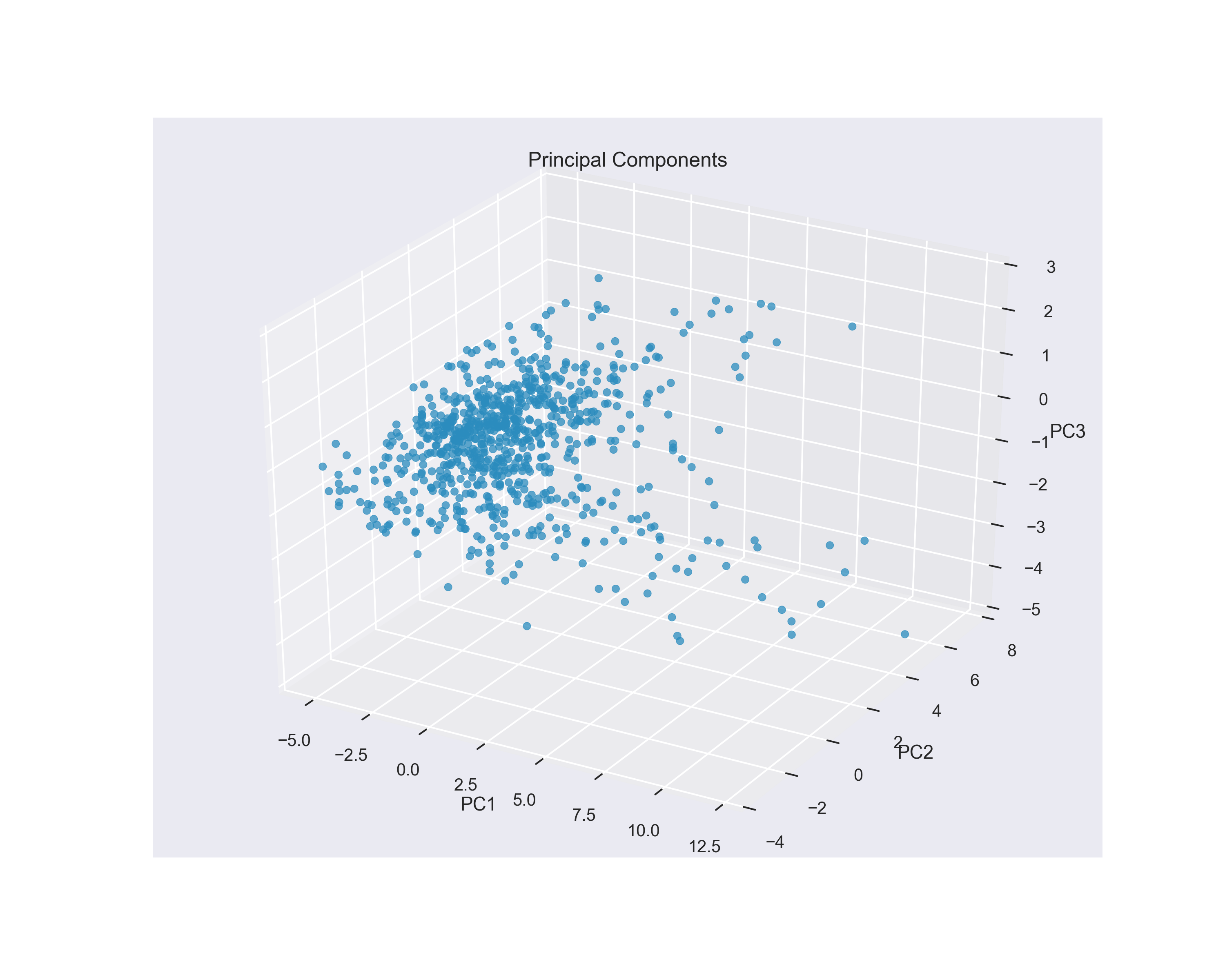
Adding a Third Principal Component
Given that 3 principal components explain 85% of the total variance, it makes sense to look at a three-dimensional plot of the top 3 eigenvalues. I used matplotlibs mpl_toolkits to create a projection for this subspace.
from mpl_toolkits.mplot3d import Axes3D

# initialize figure and 3d projection for the PC3 data
fig = plt.figure()
ax = fig.add_subplot(111, projection='3d')

# assign x,y,z coordinates from PC1, PC2 & PC3
xs = X_pca_3.T[0]
ys = X_pca_3.T[1]
zs = X_pca_3.T[2]

# initialize scatter plot and label axes
ax.scatter(xs, ys, zs, alpha=0.75, c='blue')
ax.set_xlabel('PC1')
ax.set_ylabel('PC2')
ax.set_zlabel('PC3')

plt.show()
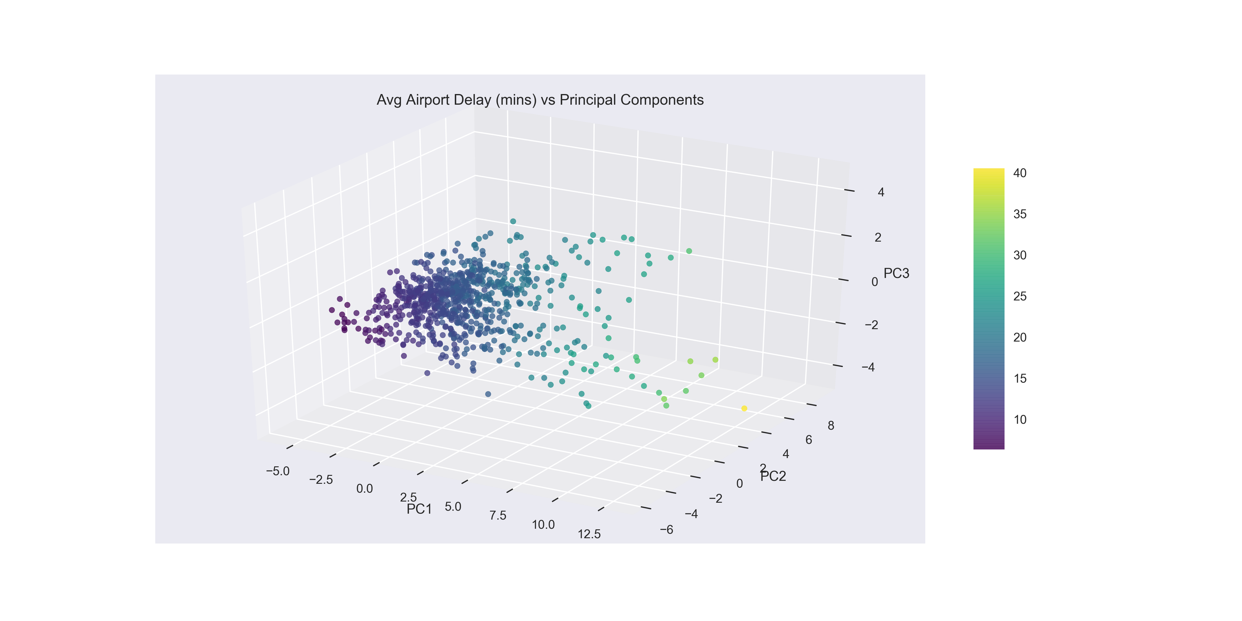
In the below plot, I colored the datapoints with the viridis color palette where the airports with low Average Airport Delays are in dark purple and the airports with high Average Airport Delays are in bright yellow. With this in mind you can see a clustering of low airport delays, that show up low on PC1 and low on PC2 in the left most corner of the figure. Out from there the airports have higher delays as you move towards the airport with the highest average delay that’s pictured high on PC2, low on PC3 and high on PC1.
Adding Colormap & Colorbar to the Plot
plot = ax.scatter(xs, ys, zs, alpha=0.75,
                  c=all_data['departures'], cmap='viridis', depthshade=True)


fig.colorbar(plot, shrink=0.6, aspect=9)
plt.show()
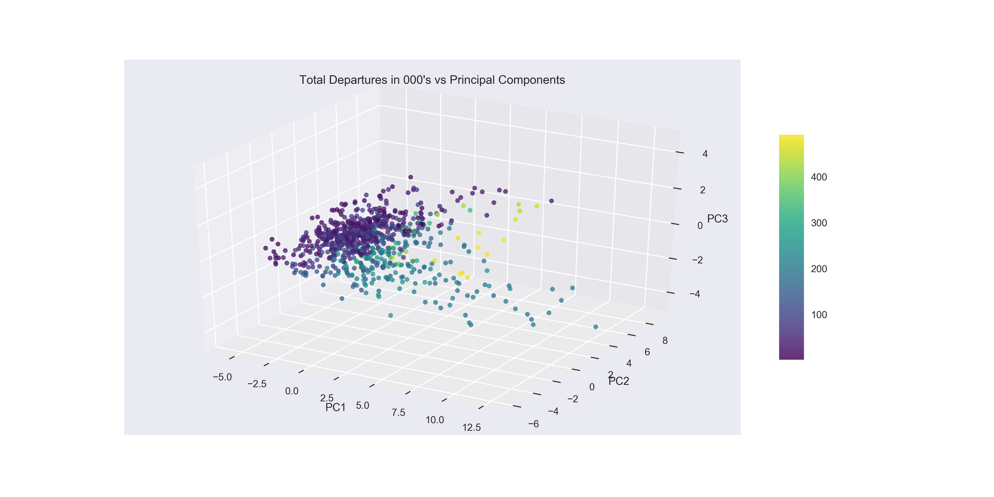
Looking at Total Departures as the colormap it is interesting to see that the smallest airports in terms of volume do appear to be clustered very low on PC1. However once you reach the 200,000 and up in flight volume (green-yellow) there’s less distinction between the medium and large sized airports along PC1. Given the information from the last plot that shows airports with low Average Airport Delay are clustered low on PC1 and low on PC2, you can see that volume of flights in and out has an impact on the largest airports (yellow), however the mid-sized airports are all the way across the spectrum with some of the worst flight delays coming from small to mid-size airports. This adds credence to some of the earlier exploratory data analysis where it appeared that size alone was not responsible for average delay times.
Using K-means++ to Cluster the Principal Components
Now that I we had reduced some of the complexity within the dataset by reducing the number of features with PCA, I decided to use the k-means++ clustering algorithm to determine if we could find a natural grouping of the data for which we could derive some analysis.
One of the downsides to the k-means algorithm is that the set up of the algorithm requires you to choose the number of clusters a priori. One method to try and aid with this issue is the elbow method. The elbow method, calculates the within-cluster sum of squared errors (distortion) for each number of clusters specified (n_clusters=i) and plots those values.
distortions = [] # sum of squared error within the each cluster
for i in range(1, 11):
    km = KMeans(n_clusters=i,
               init='k-means++',
               n_init=10,
               max_iter=300,
               random_state=0)
    km.fit(X_std)
    distortions.append(km.inertia_)

plt.plot(range(1,11), distortions, marker='o', alpha=0.75)
plt.xlabel('Number of clusters')
plt.ylabel('Distortions')
plt.show()
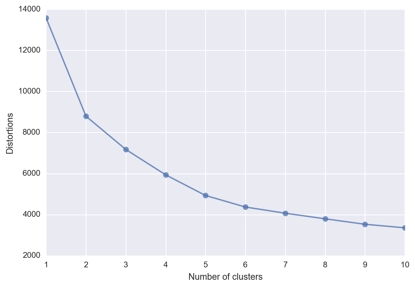
In an ideal situation you would see an “elbow” where the plot makes a sharp turn, thus indicating a good approximation for the optimal number of clusters to choose. Unfortunately in our case we don’t see such an elbow, which also indicates that k-means++ does not appear to have an optimal number of clusters to choose.
from sklearn.cluster import KMeans

km = KMeans(n_clusters=3,
           init='k-means++',
           n_init=10,
           max_iter=300,
           tol=1e-04,
           random_state=0)

y_km = km.fit_predict(X_pca)
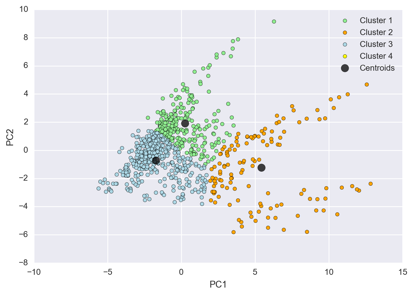
Plot Each Cluster in the 2-D Feature Subspace
Here I plotted each cluster as a different color with the number of clusters chosen at 3. As you can see the clustering isn’t optimal in this scenario and we don’t get a clear distinction between clusters.
plt.scatter(X_pca[y_km==0, 0],
           X_pca[y_km==0, 1],
           c='lightgreen',
           label='Cluster 1')
plt.scatter(X_pca[y_km==1, 0],
           X_pca[y_km==1, 1],
           c='orange',
           label='Cluster 2')
plt.scatter(X_pca[y_km==2, 0],
           X_pca[y_km==2, 1],
           c='lightblue',
           label='Cluster 3')
plt.scatter(km.cluster_centers_[:,0],
           km.cluster_centers_[:,1],
           s=85,
           alpha=0.75,
           marker='o',
           c='black',
           label='Centroids')

plt.legend(loc='best')
plt.xlabel('PC1')
plt.ylabel('PC2')
plt.show()
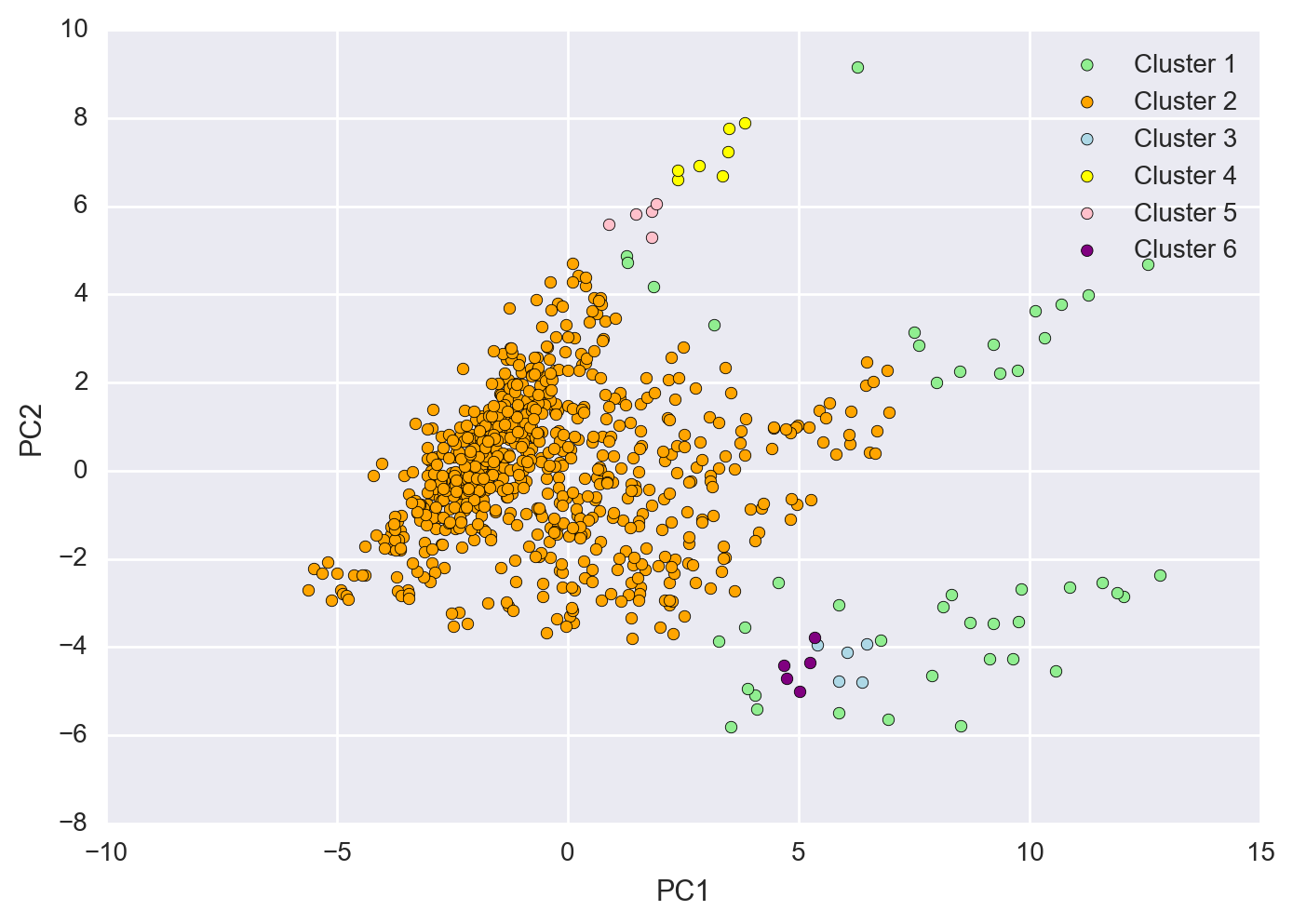
Using DBSCAN as an Alternative Clustering Method
DBSCAN is density based (DB) and captures the idea that similar points should be in dense clusters together. I tried this clustering method as well to see if we could isolate some of the points in the lower right corner of the 2-D PCA subspace, however even after modifying a number of different parameters, the dataset itself was very noisy and there wasn’t a clear demarkation betweeen clusters to really get the separation I was looking for.
from sklearn.cluster import DBSCAN

dbs = DBSCAN(eps=0.75,
             min_samples=5)

y_dbs = dbs.fit_predict(X_pca)
plt.scatter(X_pca[y_dbs==-1, 0],
           X_pca[y_dbs==-1, 1],
           c='lightgreen',
           label='Cluster 1')
plt.scatter(X_pca[y_dbs==0, 0],
           X_pca[y_dbs==0, 1],
           c='orange',
           label='Cluster 2')
plt.scatter(X_pca[y_dbs==1, 0],
           X_pca[y_dbs==1, 1],
           c='lightblue',
           label='Cluster 3')
plt.scatter(X_pca[y_dbs==2, 0],
           X_pca[y_dbs==2, 1],
           c='yellow',
           label='Cluster 4')
plt.scatter(X_pca[y_dbs==3, 0],
           X_pca[y_dbs==3, 1],
           c='pink',
           label='Cluster 5')
plt.scatter(X_pca[y_dbs==4, 0],
           X_pca[y_dbs==4, 1],
           c='purple',
           label='Cluster 6')

plt.legend(loc='best')
plt.xlabel('PC1')
plt.ylabel('PC2')
plt.show()
As you can see the points are not densely populated enough to separate themselves from the main pack and there are a number of bridge datapoints that connect the outside datapoints to this main pack.
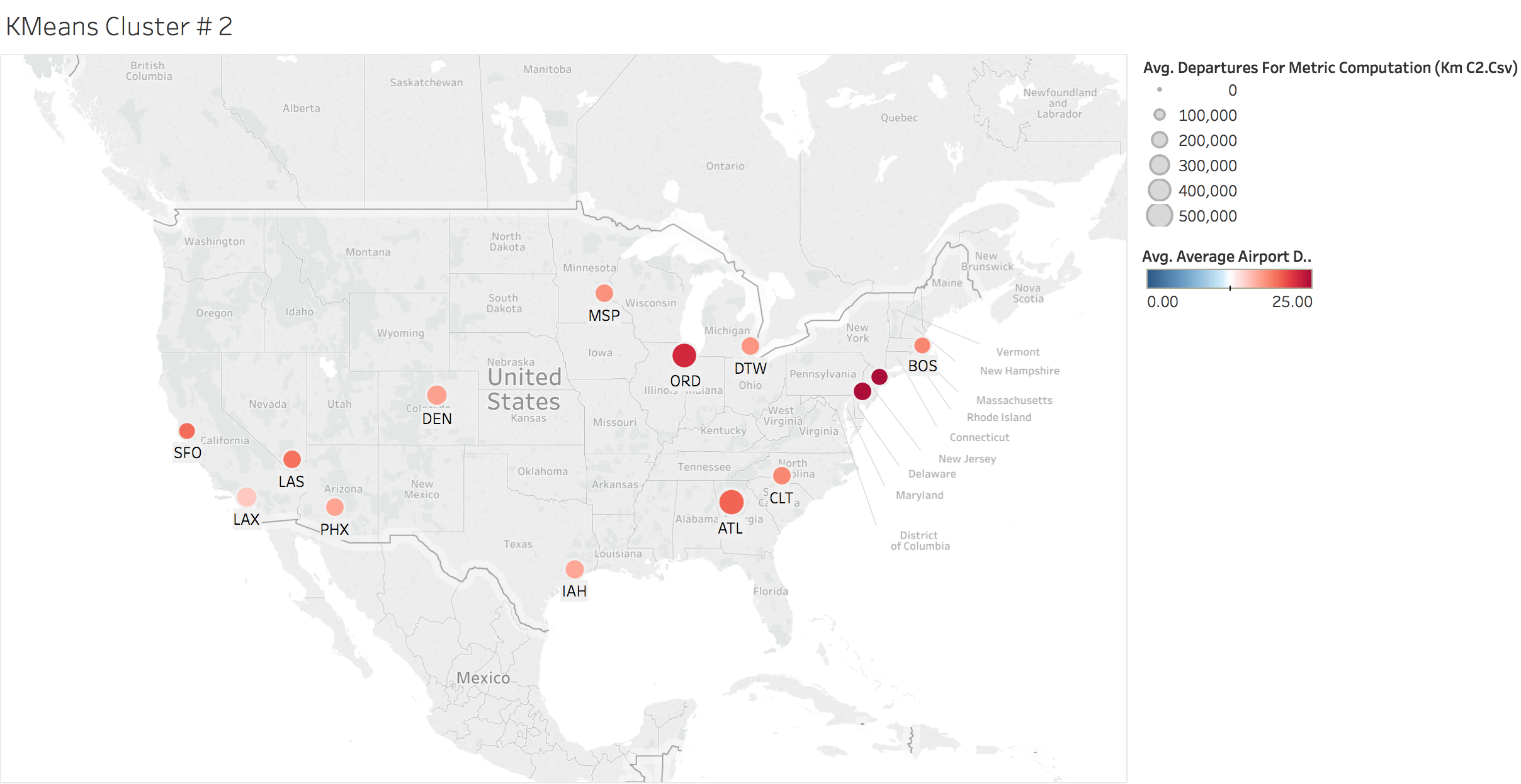
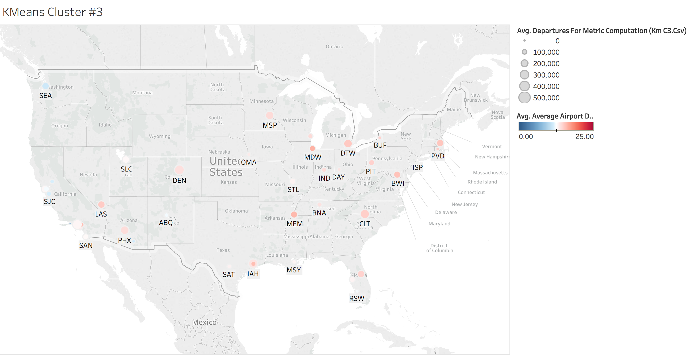
K-means Clustering by Location
Here we looked at the average airport delays by each cluster. The size of the bubbles are derived by the total number of departures and the coloring is dependent on the average airport delay time.
km_c1 = all_data[y_km==0]
km_c2 = all_data[y_km==1]
km_c3 = all_data[y_km==2]

Executive Summary:
In all I was able to see that a large percentage of the variables within the airports dataset were highly correlated with eachother and therefore explained much of the same variances. So for instance, it would not make sense to include both arrivals and departures as they both approximate the size of the airport but are almost perfectly correlated with eachother. We do not need to add this extra bit of dimensionality and can safely reduce that feature down to a singular subspace. With only three eigenvalues we were able to explain about 85% of all the explained variance and with 10 eigenvalues we reached almost 100%.
The high correlation between departure delays and arrival delays on a number of the variables would lead me to suggest key areas for determining overall lateness revolved around the origination point of each flight. I noticed that any sort of departure delay metric was generally highly correlated with arrival delay. A possible explanation for this are that as flights get delayed arriving to the airport, they’re going to set off a cascading effect where the flights are also delayed heading out. As you also need to factor in the fact that each flight requires the staff to clean the cabin, sometimes change crew, refuel and other aspects all before the next flight can board.
Some other interesting observations that would be worthwhile investigating are the connection between all New York airports and delay times. Looking at if there is a connection between variable weather with airports. Given many peoples experiences with the Chicago (ORD) airport and frequent wind, I would guess that will be a factor for at least some of those airports. I also noticed that the taxi-out and taxi-in times were much greater for larger airports. I would hypothesize that this is becuase they have much more flights that need to queue up to take off, all while managing the larger volume of flights trying to land.
Possible Next Steps:
It would also be really interesting to check and see if the airports that are frequently delayed, have high volume traffic to eachother. In other words, do the worst offending airports frequently fly to eachother, and if so is it the issue that one airport is directly causing delays at the other airport or could they both benefit from efficiency improvements.